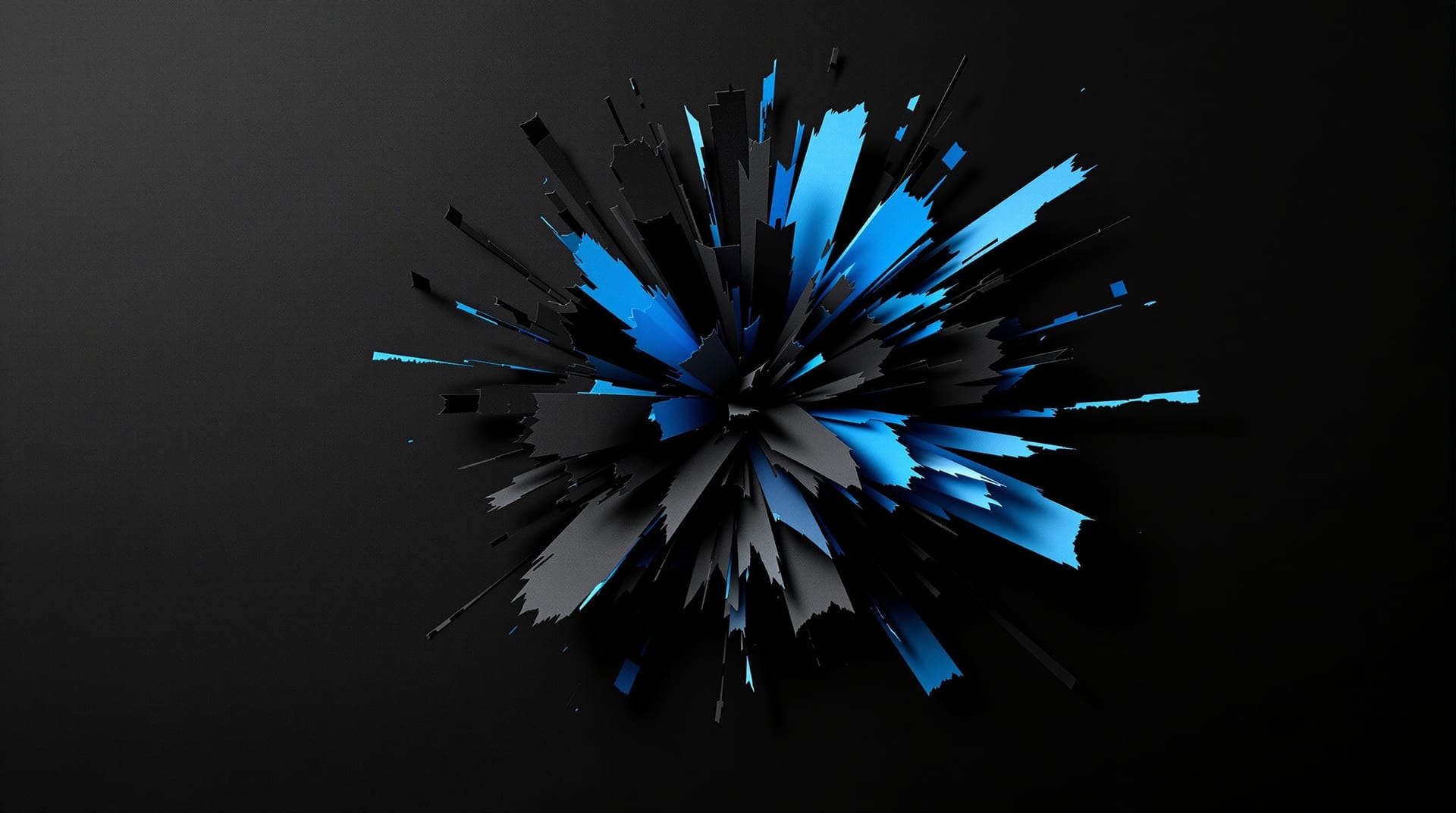
An onomatopoeic sound effect is the only element on a comics page that is simultaneously a word, a picture and an event. It has to be readable enough to identify, graphic enough to sit inside the drawing without looking pasted on, and placed precisely enough that the reader assigns the noise to the right object at the right moment. Treating it as display typography rather than as decoration is what keeps all three properties in balance.
The three variables that carry the meaning
Almost everything a sound effect communicates beyond its literal spelling is carried by three drawing decisions.
Weight and size encode volume. This is the most direct mapping in the medium: a heavier, larger effect is louder. The scaling is perceptual rather than linear — doubling the cap height of an effect does not read as twice as loud, it reads as an order of magnitude louder, because the effect's area quadruples while the panel stays the same. A quiet effect can be smaller than the dialogue lettering around it, which is a resource often left unused.
Contour encodes texture. Hard, straight-sided letters with sharp corners and abrupt joints read as impact: metal, breakage, gunfire. Soft, continuously curving letters with tapering strokes read as fluid or organic sound. Ragged, torn-edged letters read as distortion or destruction. The reason these mappings feel obvious is that they mirror the physical processes that produce those sounds, and readers have been trained on the mapping since childhood.
Direction and skew encode motion. An effect drawn along a line of travel reads as moving with the thing that made it. An effect drawn on a strong diagonal reads as faster than a horizontal one of identical size. An effect drawn in perspective, receding toward a vanishing point in the drawing, locates the sound source in depth — a technique borrowed directly from the display lettering conventions described under logotype design.
Construction
Effects are built the way display logotypes are built: a resolved core drawing, then derived layers. The face is drawn first as a single flat shape, with the fitting problem — how the letters interlock — solved before any outline, bevel or extrusion is added. Because an effect is usually four to eight characters long, this is one of the few places in lettering where extremely aggressive custom joins are appropriate: strokes can be shared between adjacent letters, a descender can swing under two neighbours, and the whole word group can be built as one continuous mass.
The derived layers do specific work. An outline in the background value is what allows an effect to sit on top of busy artwork without dissolving into it. An extrusion supplies apparent mass, which is why heavy impact effects almost always carry one. A rough or spattered edge treatment supplies texture. Each layer costs legibility, and the practical limit is reached at the point where a reader can no longer identify the word in a quarter-second glance — which is roughly the amount of attention any effect actually receives.
Placement, and the difference between an effect and a label
A sound effect should touch, overlap or emerge from the thing that made the noise. An effect floating in clear space beside the action becomes a caption describing the sound rather than a representation of it, and the difference in reading experience is substantial. Overlapping the source also solves a compositional problem: the effect becomes part of the drawing's mass rather than a separate object competing with it.
Reading order still applies. An effect is read at the point the eye reaches it, so an effect placed after a balloon in the reading path is heard after that speech. Getting this backwards — putting the crash below and right of the dialogue when the crash interrupted the dialogue — inverts the timing of the scene. The reading-path rules that govern this are set out under word balloons, and they apply to every element in the panel, not only to speech.
A related judgement is when to omit the effect entirely. A silent panel is a genuine tool, and an effect added to an already-clear action — a door visibly slamming, a punch visibly landing — can flatten the moment by insisting on something the drawing has already communicated. The strongest use of effects is uneven: several panels without any, then one that dominates.
Spelling, translation and the limits of the convention
The spellings themselves are conventions, not transcriptions, and they are language-specific. Consonant clusters that read as impact in English do not necessarily do so elsewhere, and different comics traditions have developed substantially different repertoires — some of them extending onomatopoeia to states with no sound at all, such as silence, staring or tension. A translated edition that carries the original effects as artwork keeps the drawing intact but leaves the reader decoding an unfamiliar convention; one that redraws them preserves the reading but loses the original graphic. Neither choice is free.
The technical dimension of this is encoding. Where effects are set from a font rather than drawn, the required characters — extended Latin, and in many cases entire non-Latin scripts — have to exist in the file. Character coverage, normalisation and the properties that govern how such text is processed are defined by the Unicode Consortium. The general problem of matching a font's coverage to a translated edition is discussed under lettering fonts.
Where the graphic vocabulary comes from
The display letterforms used for effects are not native to comics. They descend from nineteenth and early twentieth-century commercial display lettering: playbills, poster type, shop fascias, packaging and advertising, all of which had already solved the problem of making a short word maximally emphatic at a distance. Comics inherited that vocabulary wholesale and then specialised it for a page-sized field and for interaction with drawn artwork.
Studying the source material is more useful than studying imitations of it. Collections of original lettering and commercial display work, including specimen material from the wood-type and poster era, are held and digitised by research collections such as the Letterform Archive, and a substantial quantity of out-of-copyright printed ephemera and trade catalogues can be read through the Internet Archive. The historical categories those forms fall into are summarised in the serif field guide.