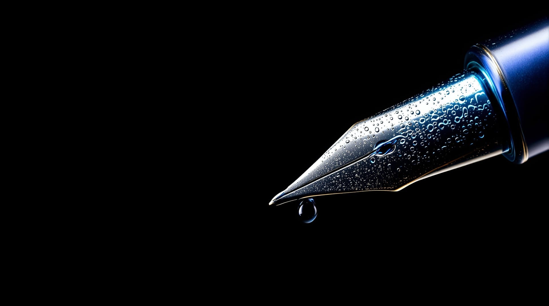
For most of the twentieth century, the words on a comics page were drawn in ink by hand, directly onto the same board carrying the artwork or onto an overlay registered to it. The physical facts of that process — the width a nib lays down, how long ink takes to dry, the fact that a mistake costs a patch rather than a keystroke — produced nearly every convention the field still uses.

The blue-line workflow
The governing constraint was reproduction. Line artwork was photographed for platemaking on high-contrast orthochromatic film, which is insensitive to a narrow band of light blue. Anything drawn in a sufficiently pale non-photo blue therefore did not appear on the plate at all. That single fact made the whole workflow possible: guide lines, balloon shapes, letter spacing marks and correction notes could be drawn as freely as needed and simply left on the board.
A typical sequence ran as follows. The letterer read the script and estimated the area each speech would need at the chosen letter height. Balloon outlines were sketched in blue at those positions, tested against the underlying drawing so that no tail crossed a face and no balloon covered anything load-bearing. Horizontal guide lines were then ruled in blue at the cap height and baseline for every line of dialogue, usually with an adjustable lettering guide that steps a pencil point down a fixed distance on each rotation. Only then did ink go on the board: letters first, balloon outline second, tail last.
The ordering matters. Lettering first and drawing the balloon around the finished text guarantees a consistent margin between the text block and the balloon wall, and it prevents the far more common failure of writing to fit a shape already committed to. The same principle survives in digital work, where the balloon is generated from the set text rather than drawn first; the mechanics are described on the digital lettering page.
Nibs, pens and the shape they impose
Three families of tool account for nearly all hand lettering, and each imposes a different letterform logic.
- Pointed flexible nibs. A steel nib whose tines spread under pressure, producing a stroke that swells from a hairline to a broad mark according to how hard it is pressed. Contrast comes from pressure, which means it can be placed anywhere in a stroke — the source of the thick downstroke and thin upstroke pattern.
- Broad-edge or chisel nibs. A nib with a flat writing edge held at a constant angle. Contrast comes from direction rather than pressure: the stroke is broadest perpendicular to the edge and finest parallel to it. Hold the edge at roughly 30 degrees and the resulting alphabet automatically acquires the angled stress and bracketed junctions of a humanist letterform, which is why so much historical lettering shares a family resemblance.
- Technical and ruling pens. Tools that lay a constant-width line regardless of pressure or direction. Monoline lettering, balloon outlines, panel borders and most comics dialogue lettering are drawn with these, in widths commonly between about 0.3 and 0.8 millimetres for text and heavier for borders.
Brushes sit apart. A pointed sable brush can produce the full range from hairline to a stroke many millimetres wide within a single gesture, and it can accelerate and taper in a way no rigid nib can imitate. That expressive range makes brush work the traditional tool for sound effects and for display lettering where energy matters more than uniformity — the reasoning is expanded under sound effects.
Surface, ink and the physics of a clean line
Board choice is not incidental. Smooth-surface bristol — plate finish — has a hard, closed surface that lets a nib travel without catching and keeps ink sitting on top rather than bleeding into the fibres, which is why it is standard for lettering. Vellum-finish bristol has a slight tooth that grabs pencil and brush pleasantly but drags a fine nib and feathers thin ink.
Ink for reproduction is dense carbon black, opaque enough to photograph as solid at any line width. It is also slow to dry relative to the pace of work, which is the practical origin of a habit still visible in the physical evidence: lettering proceeds from the top of the board downward and, for right-handed workers, generally from the left, so that a hand never rests on a wet line. Corrections were made with opaque white paint over the error, or by cutting a patch of matching board and adhering it, then re-lettering on the patch. Neither is invisible on the original, and both are invisible in reproduction, because the camera sees only the tonal difference the plate can carry.
Ruling, curves and consistency
Straight lines were ruled against a T-square running on the edge of a drawing board, with a triangle for verticals. Balloon walls are not straight, and freehand ovals betray every wobble at reproduction size, so ellipse guides — templates of nested elliptical apertures at fixed proportions — and french curves were standard. A balloon drawn against a guide has a continuously changing radius with no flat spots, which is precisely what the eye checks for without knowing it.
Consistency across a long job was maintained by discipline rather than by any tool: the same cap height throughout a page unless emphasis demanded otherwise, the same pen for all body dialogue, the same interlinear distance ruled from the same guide setting. The visible variation in good hand lettering is small and non-systematic — each letter differs slightly from its neighbours, but no letter differs systematically from the ones on the previous page. Digital fonts invert this: perfect within a page, identical across a career. The alternate-glyph machinery described under lettering fonts exists to reintroduce the first kind of variation.
Building a useful practice sheet
A practice sheet should reproduce the constraints of a page, not display a row of isolated perfect capitals. Rule several short baselines at the intended working height and write the same sentence more than once, keeping the tool, ink and surface unchanged. Repetition exposes whether width, slant and spacing remain stable after the first careful line. Include troublesome pairs, punctuation and a few bold words; dialogue is made from relationships between marks, so an alphabet written once says little about how those marks will behave beside one another.
Review the sheet at reproduction size before correcting it. At arm's length, mark only faults that survive reduction: a closing counter, a word that darkens because its letters crowd, a baseline that drifts, or an emphasis style that no longer belongs to the same hand. Then make a second sheet changing one variable only. A narrower nib may open counters but also weaken the page's overall colour; more interlinear space may improve clarity but make the text block too tall. Keeping the other conditions fixed turns practice into diagnosis rather than ornament.
The final exercise is correction. Let the ink dry, cover one deliberately spoiled letter, and redraw it without changing the surrounding spacing or weight. On finished work, the repair has to disappear at reproduction size even if it remains visible on the board. Practising that small recovery under calm conditions is more useful than discovering the behaviour of ink, white paint and paper for the first time against a delivery clock.
Studying the originals
Reproduction hides most of what is interesting about hand lettering. Printed at final size on absorbent paper, a patched correction, a blue guide line and a slightly overshot curve all vanish. Original artwork and specimen material, where it can be seen at scale, shows the working method rather than the result — collections such as the Letterform Archive hold lettering and calligraphic originals, and museum holdings including those published by the Getty cover the manuscript traditions the broad-edge alphabets descend from.
For printed instruction, many mid-century lettering manuals have passed out of copyright and are readable through the Internet Archive; they are unusually direct about tools and dimensions because they were written for people who had to produce work rather than appreciate it. Contemporary technical writing on comics lettering practice is published on practitioner sites such as Klein Letters, which documents construction methods at length.