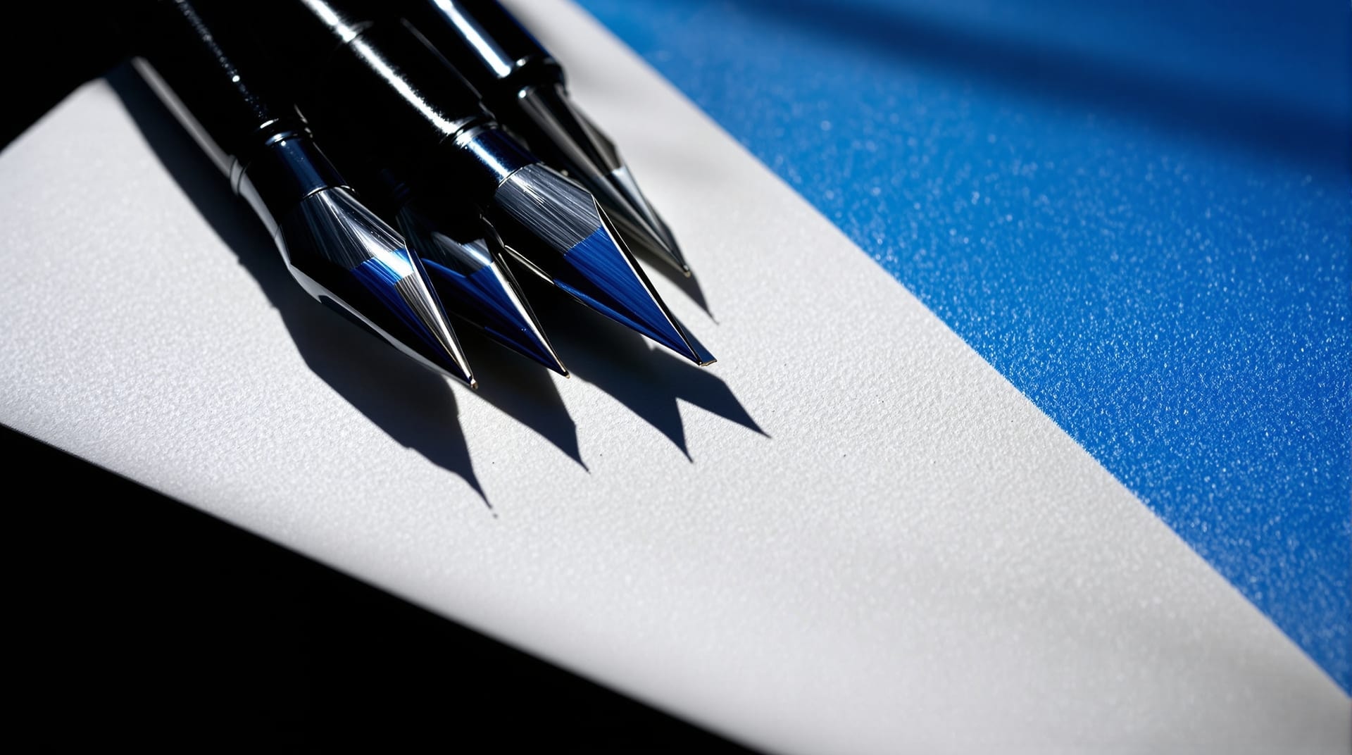
Serifs Up is an independent, non-commercial reference on comic-book lettering and display typography. It exists to explain how the letters on a comics page and on an entertainment logotype are actually made — the tools, the geometry, the conventions, and the reasons behind them. Nothing here is for sale, and no service is offered. The subject is the craft itself.
Lettering is the least discussed and most consequential layer of a comics page. A reader who notices the lettering usually notices it because something has gone wrong: a tail pointing at the wrong mouth, a balloon that forces the eye backwards, a sound effect that swamps the drawing it is supposed to punctuate. Done well, lettering is invisible in the way good typesetting is invisible — it disappears into the act of reading while quietly controlling pace, volume and sequence.
What this reference covers
The material is organised into three broad groups. The first is comics-specific craft: word balloons and their placement, sound effects treated as display typography, and the pen-and-ink tradition the whole discipline grew out of. These pages describe practice as a field, not as any individual's method, and they treat the conventions as what they are: solutions that were arrived at repeatedly by many hands, then hardened into expectation.
The second group is typographic fundamentals, written for people who draw letters rather than only set them. Letterform anatomy gives the vocabulary — stem, bowl, counter, aperture, terminal — that makes it possible to say precisely what is wrong with a drawn character. Serif classification traces how bracket shape and stroke contrast separate an old-style face from a didone, and why those differences carry period associations that a display logotype can borrow. Legibility and readability covers the measurable side: contrast ratios, size thresholds, and the difference between a letter that can be identified and a text that can be read comfortably.
The third group is applied display work. Logotype and masthead design deals with the compressed problem of making four or five words recognisable at thumbnail size and at billboard size with the same drawing. Lettering fonts and letterform construction covers the shift from drawn alphabets to digital families, and the OpenType machinery — alternates, ligatures, contextual substitution — that lets a font imitate the irregularity of a hand.
Why lettering is its own discipline
Typesetting starts with an existing alphabet and arranges it. Lettering starts with a specific string of words and draws them to fit a specific space. The distinction matters because almost every hard problem in comics lettering is a fitting problem: a fixed area of artwork, a fixed quantity of dialogue, and a reading path that must run left to right and top to bottom without the reader ever having to guess. A typesetter can change the measure. A letterer usually cannot change the drawing underneath.
That constraint produces conventions that look arbitrary until the reason surfaces. Comics lettering has historically been uppercase-dominant because capitals sit on a single baseline with a flat top edge, which packs efficiently into the irregular shapes left over between figures. The crossbar on a capital I is restricted to the pronoun and to initials, because an unadorned I reads as a lowercase l or a numeral 1 inside all-capital text. Balloon tails are drawn as tapering wedges rather than lines because a wedge encodes direction at a glance even when it is a few millimetres long.
Sources and further reading
Where a claim can be checked against a primary source, the relevant institution is linked rather than paraphrased. The Letterform Archive is a research collection of type specimens, lettering and graphic design; its digitised holdings are the closest thing the field has to a public reference library of original material. Google Fonts Knowledge is a free, structured introduction to type terminology and typesetting practice. Historical printed matter that has fallen out of copyright is often findable through the Internet Archive, which is where a good deal of the primary evidence for early lettering practice now lives.
A full list of the resources cited across the site, each with a plain one-line description, is kept on the resources page. Definitions for the terminology used throughout are collected in the glossary.
Editorial approach
Three rules govern everything published here. Techniques are described generically, never attributed to a named practitioner or studio. No claim is made that any publisher, brand, artist or awards body used, approved or endorsed any technique, typeface or design shown or described. And where a well-known published work is mentioned, it is mentioned only as a general cultural fact of the medium — American comic books were hand lettered as a matter of routine from the 1930s until the 1990s, which is a statement about an industry rather than about any person in it.
The result is meant to be useful to letterers, cartoonists, type and graphic designers, design students, and readers who have simply wondered why the words in a comic look the way they do.
Reading a lettered page in passes
A useful critique separates the page into passes instead of asking whether the lettering simply looks right. First read for sequence: the eye should meet balloons and captions in the intended order without doubling back. Then read only the words, checking line breaks, emphasis and the visual shape of each block. A third pass ignores language and follows the geometry — margins around text, tail direction, repeated outline weights and the distance from lettering to trim. For files intended for print or screen, the final pass belongs to the exported page, not the editable source. The digital lettering workflow explains why an apparently correct working file can still change during output.
This separation makes criticism precise. A balloon can be well drawn yet badly placed; a text block can be evenly spaced yet broken into awkward phrases. Naming the failing system prevents a local repair from disturbing something that already works. Moving a balloon to solve reading order may expose a tail problem, while shrinking type to solve fit may create a legibility problem. The most economical correction is the one that fixes the cause at the earliest stage: copy before line breaks, line breaks before balloon shape, balloon shape before placement, and placement before final polish.